![]()
New Age Meats
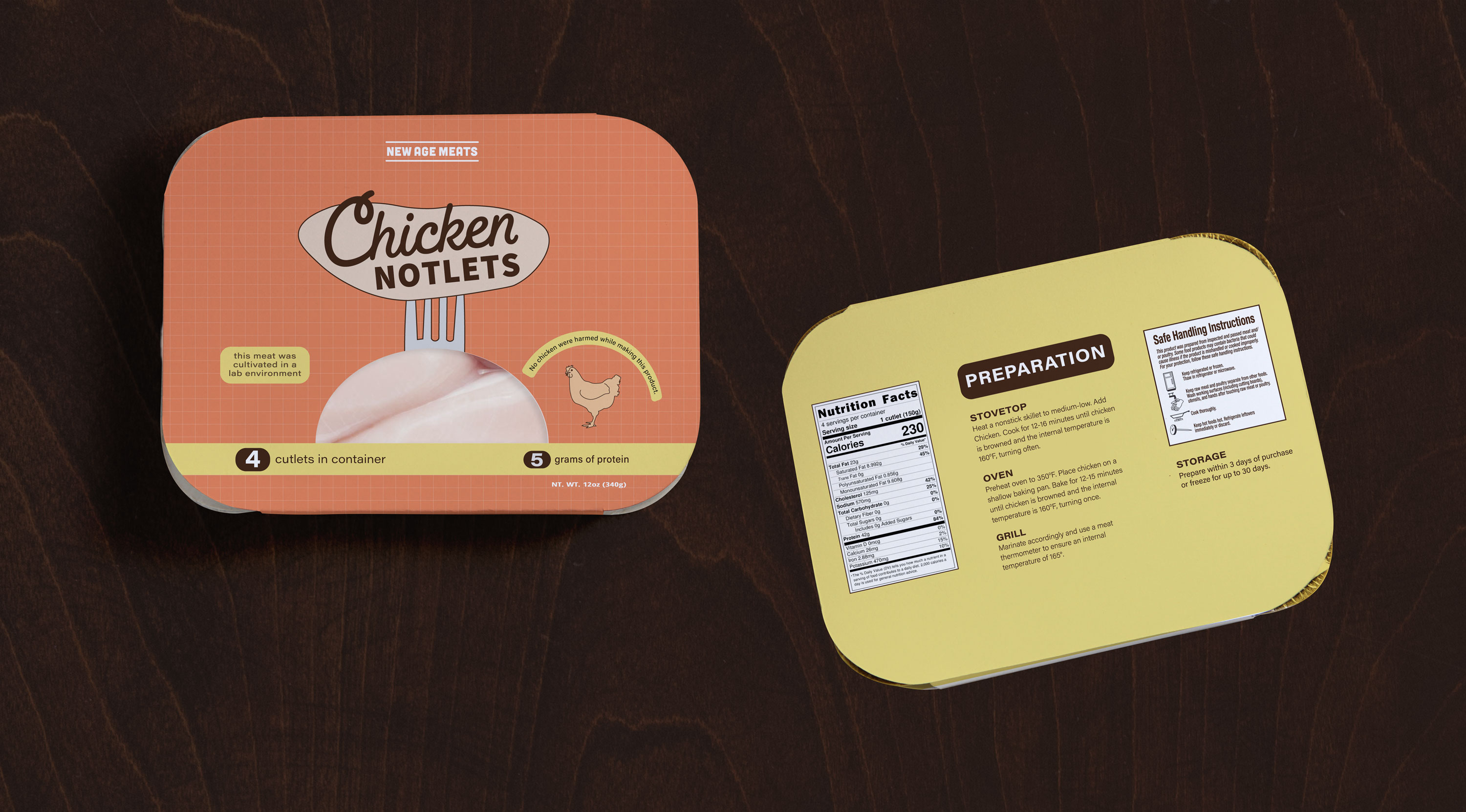
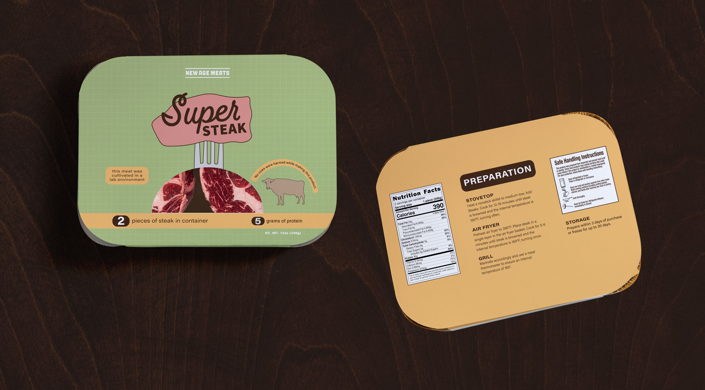
Cultured meat packaging with a nostalgic vintage inspired aesthetic
Problem to Solve
The Boomer demographic does not necessarily trust new technology when it comes to food, especially meat according to an article published in “The Star.” How do we get Boomers to be excited about trying cultured meat and to catch their attention enough to get them to purchase the product in store?
Solution
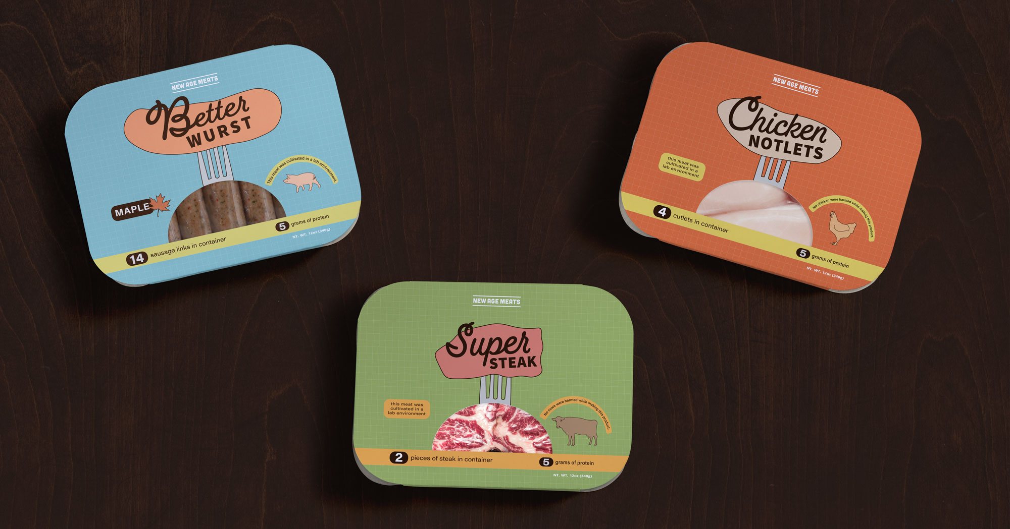
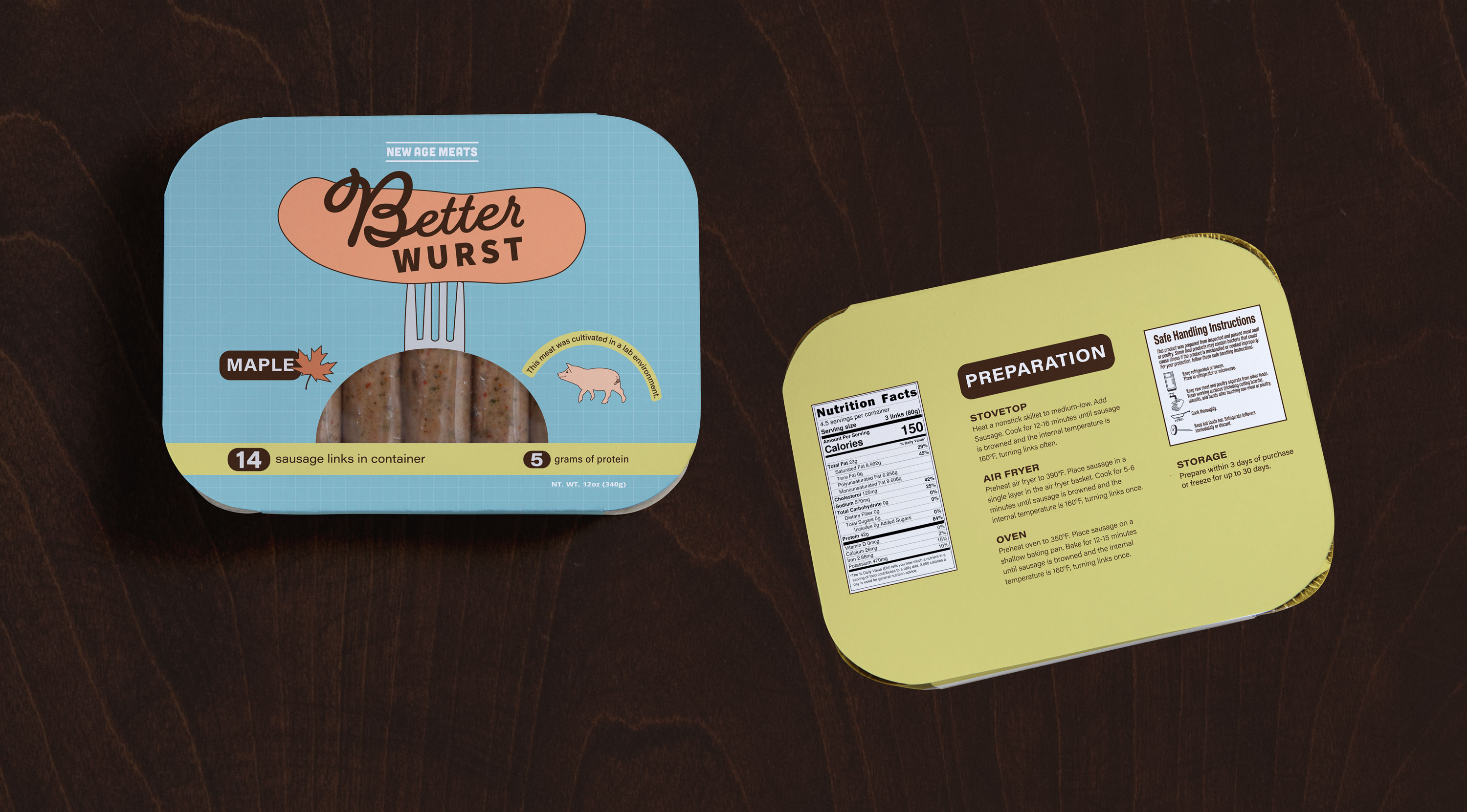
We need to present the product in a trustworthy way while also appealing to Boomers’ general aesthetic preferences and sensibility. The final design solution appeals to Boomers nostalgia by referencing 60s and 70s graphic design colors and themes. Referencing this familiar aesthetic will allow the demographic to be more comfortable trying this new product.
duration
10 weeks
what i did
Concept, Branding, Illustration, and Packaging Design
project type
Solo
tools
Illustrator, Photoshop, pencil and paper
brand concept
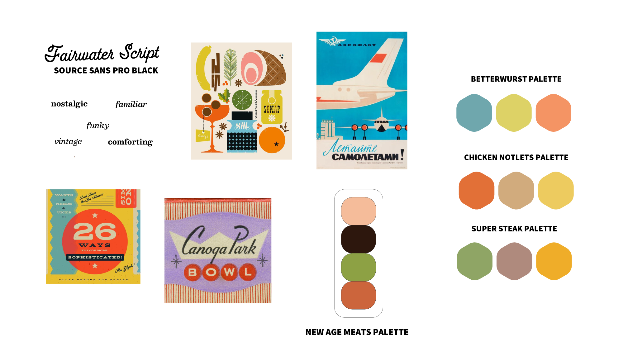
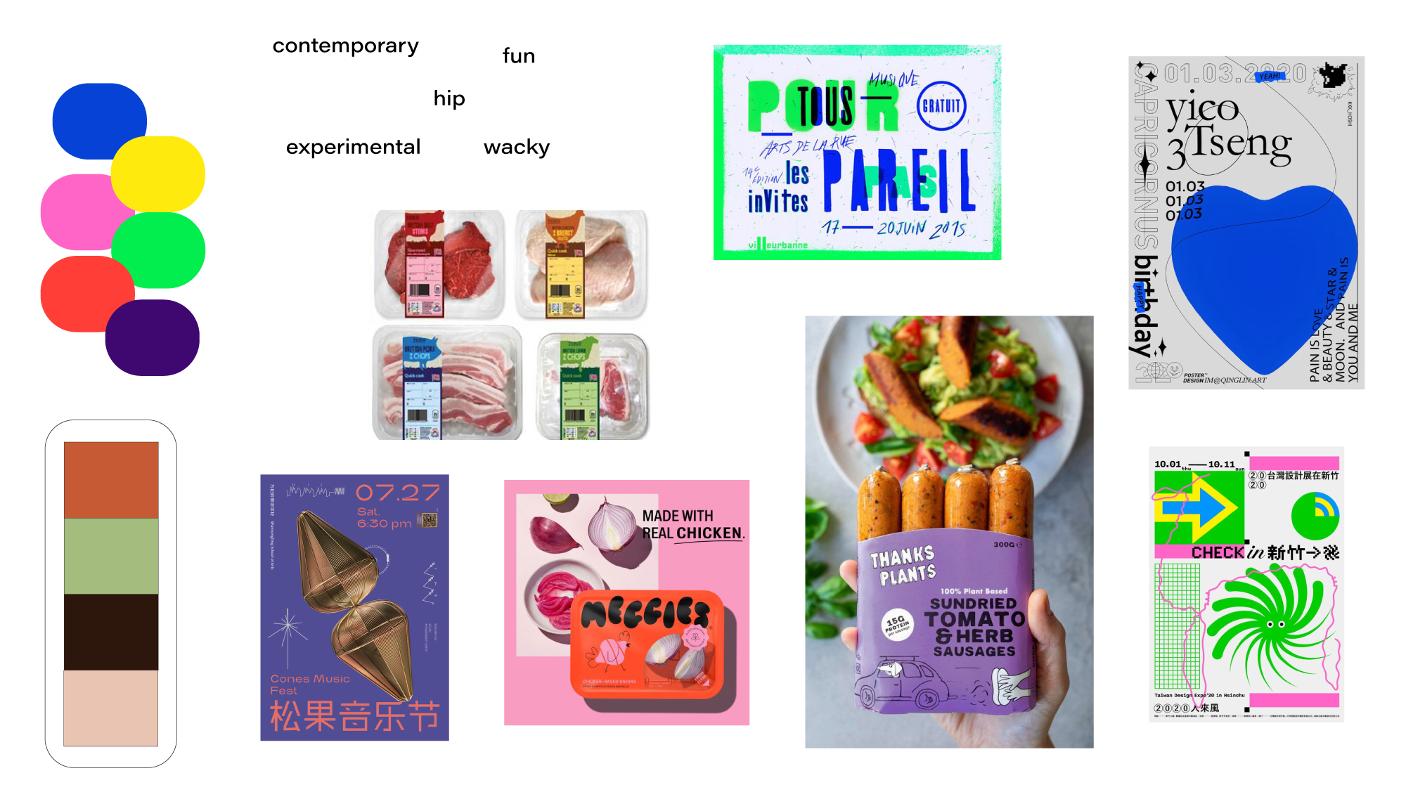
Two mood boards were initially proposed, with two very different directions. One was hyper modern with a contemporary aesthetic and the other more vintage and nostalgia inspired. After evaluating the intended demographic, which skewed towards baby boomers, the vintage inspired direction was chosen.
![]()
![]()
research and audience
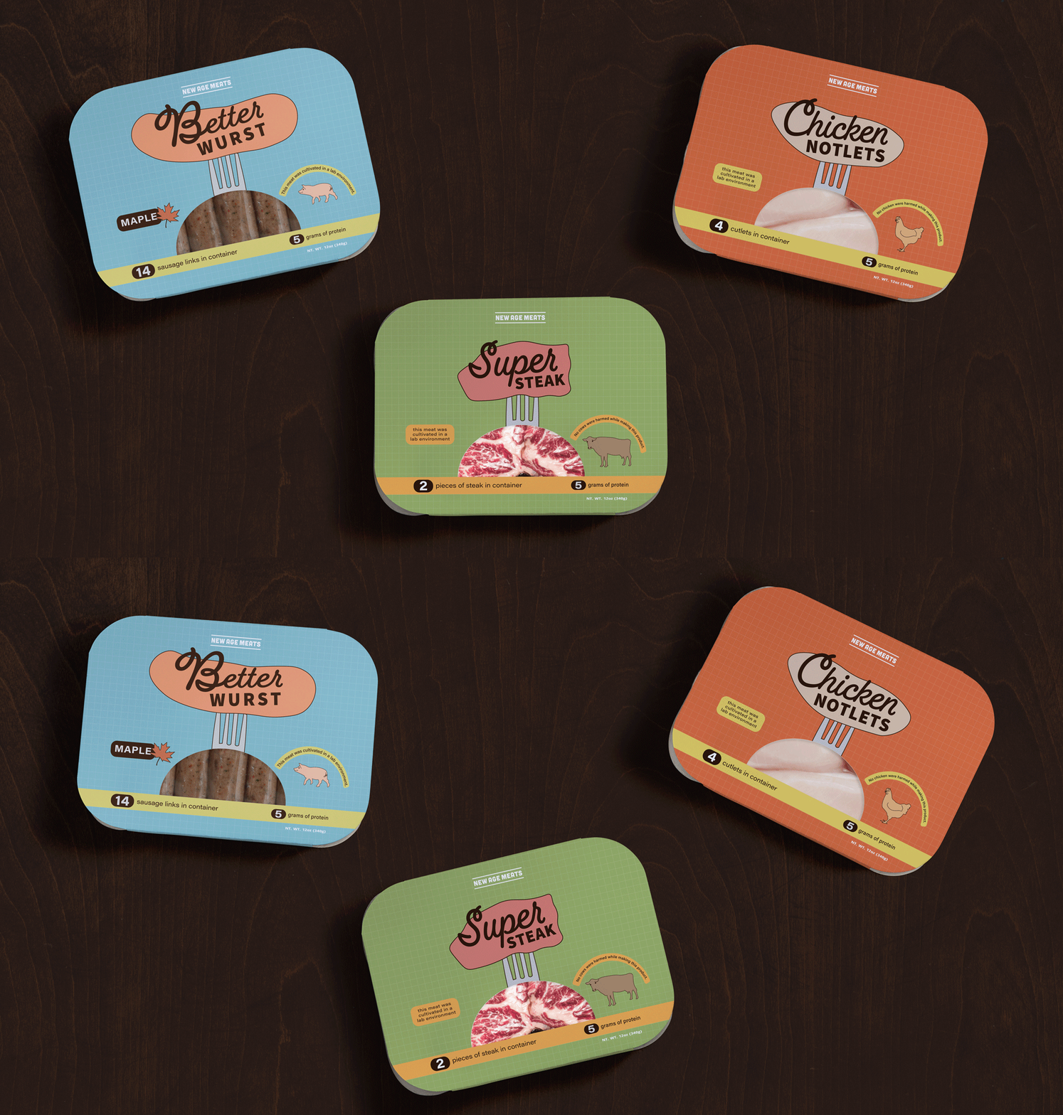
Research was done on 60’s and 70’s graphic design, particularly logo design and signage. In additon, a category study on plant-based and cultured meat was completed. I observed the existing branding for the parent brand ‘New Age Meats’ and its’ characteristics before beginning creation of the the three sub-brands (Betterwurst, Chicken Notlets, and Super Steak.) The demographic is Baby Boomers (people born between 1946-1964)
process
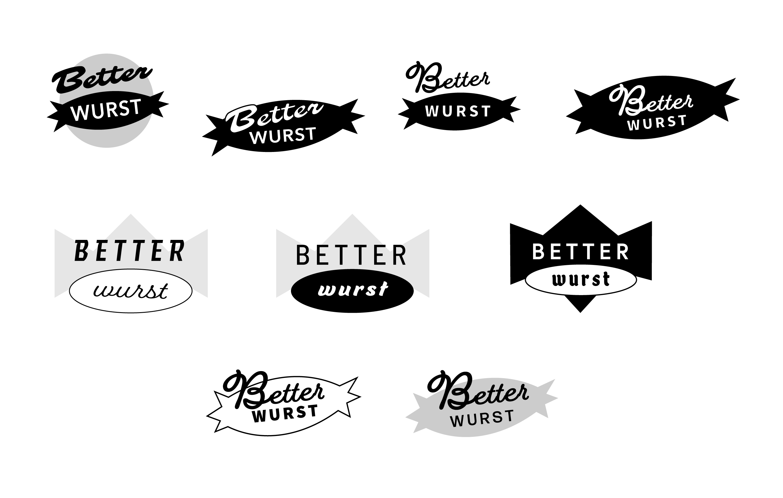
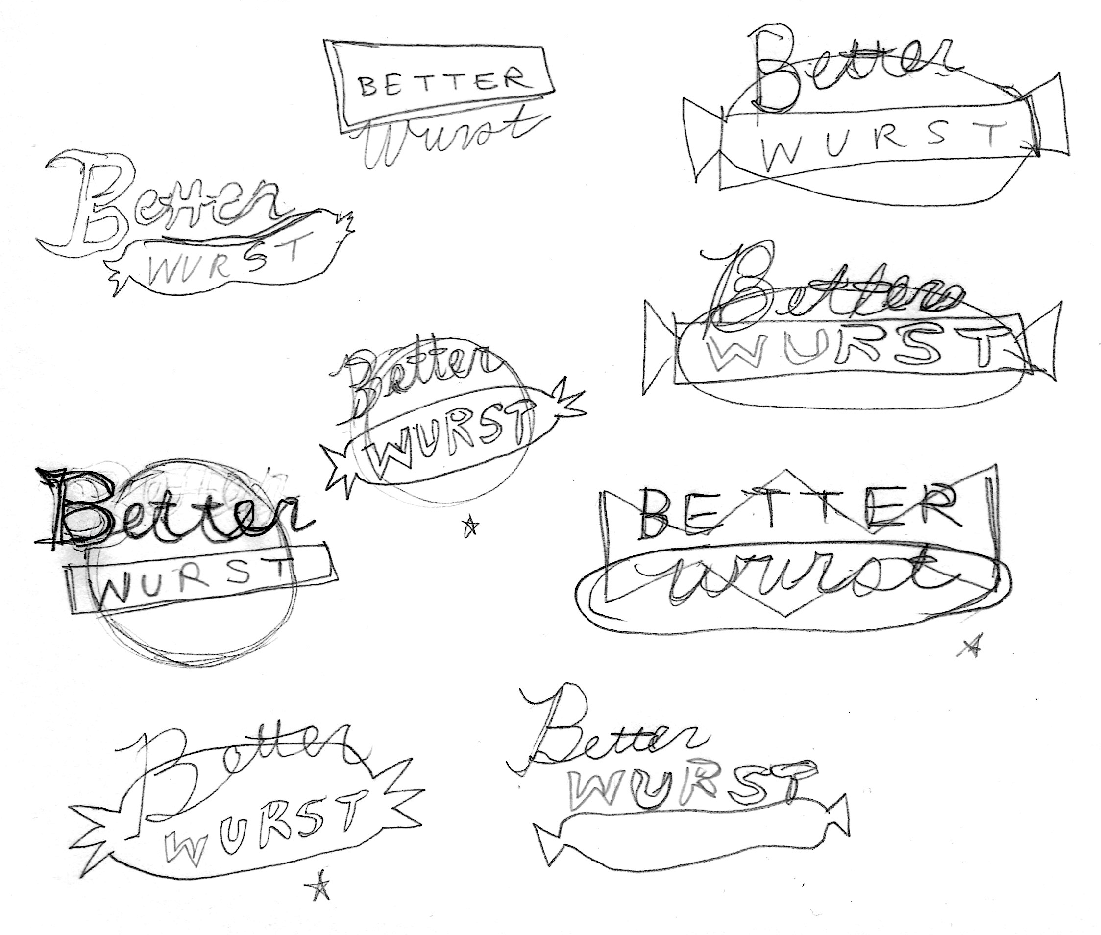
I began with looking at similar products in the category and noticing themes and conventions throughout existing brands. Vintage design references were sourced, including some 60’s & 70’s food packaging, food advertisements, as well as motel signage. The visual themes that surfaced were the combination of sans-serif and serif or script fonts and use of background shapes to ground these designs. The “Betterwurst” design was completed first and the “Chicken Notlets” and “Super Steak” designs followed.
![]()
![]()
![]()
![]()
Wordmark Iteration and Process
![]()
![]()


![]()
![]()
![]()
