Problem To Solve
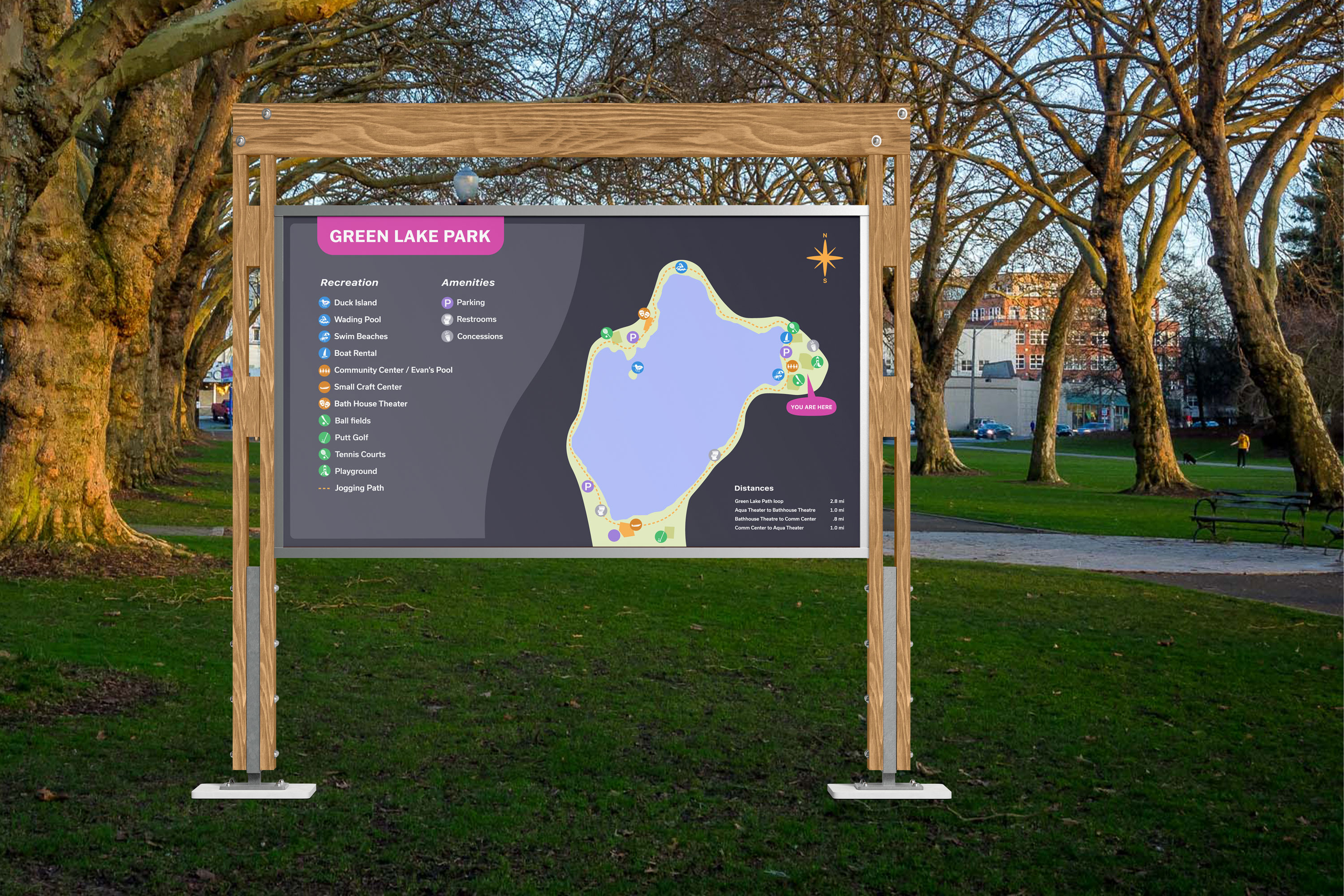
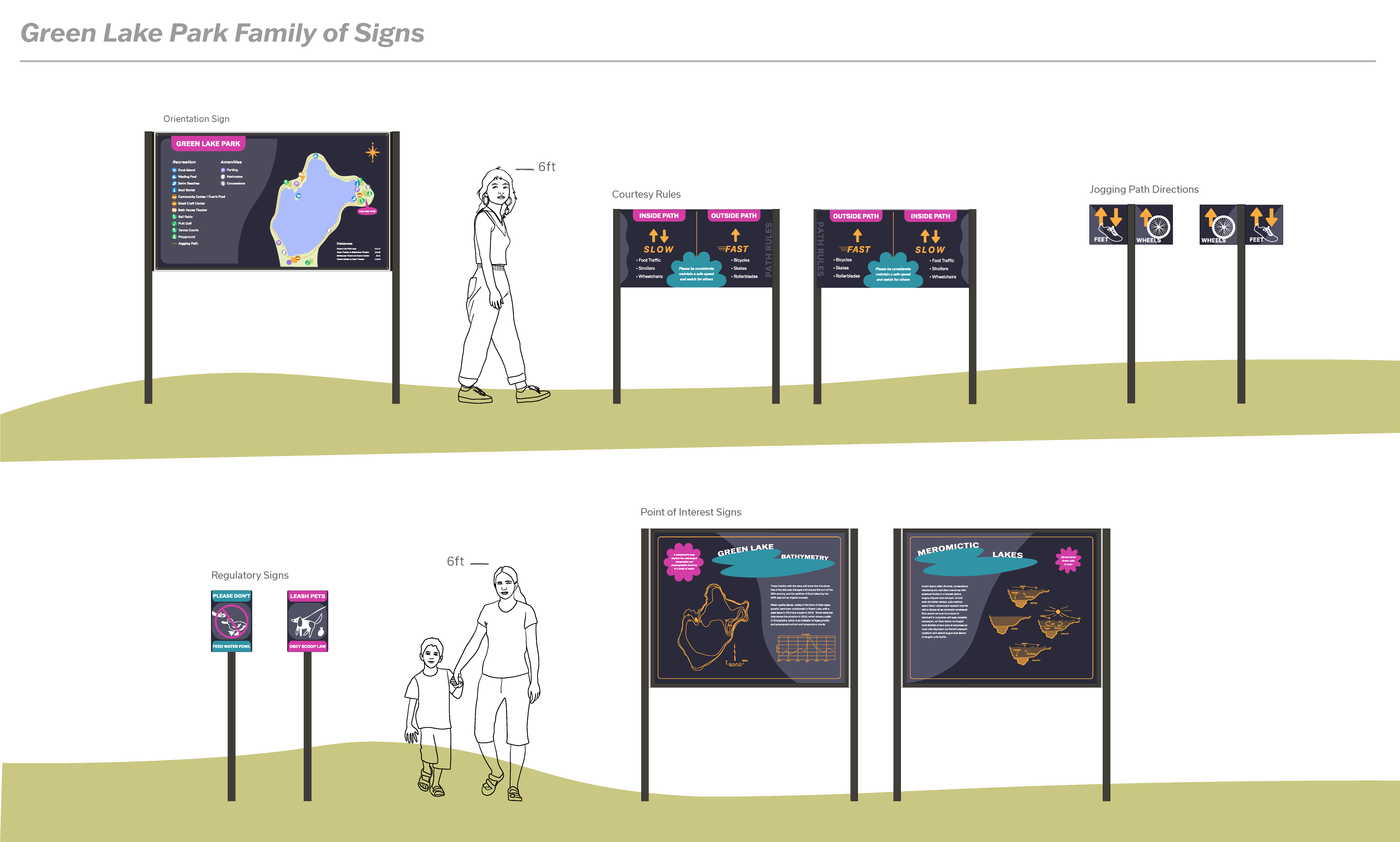
Green Lake Park’s wayfinding system is dated and inconsistent throughout the different signage. Green Lake Park is a vibrant, busy, and fun park with a range of visitors and a range of functions. The current signage lacks consistency and character. The park needs a unified look and effective wayfinding system that is palatable and easily navigable to a broad range of patrons but also provides visual interest and excitement.
Solution
I landed on a concept that focuses on whimsy and explores the mysteries that the lake itself holds, the history of the water and how the lake came to be. The design story is fun and playful while maintaining legibility and accessibility by centering a modern palette with a high level of contrast. Seattle is a modern and progressive city so this redesign at one of it’s most prominent parks reflects that ideology.
Duration
8 Weeks
What I did
Concept, Environmental Design, Art Direction, Layout
Project Type
Solo
Tools
Illustrator, Photoshop, Fresco, pencil and paper
Research and Audience
To research the park I visited a few times to make notes and take photos of the existing signage. I observed the patrons who were present when I was at the park. There were people of all ages and who seemed to come from various different backgrounds. To find the visual direction for the wayfinding system, I looked at modern signage for other parks and museums around the world. For the mural, I looked into the history of the lake and its origin.
Process
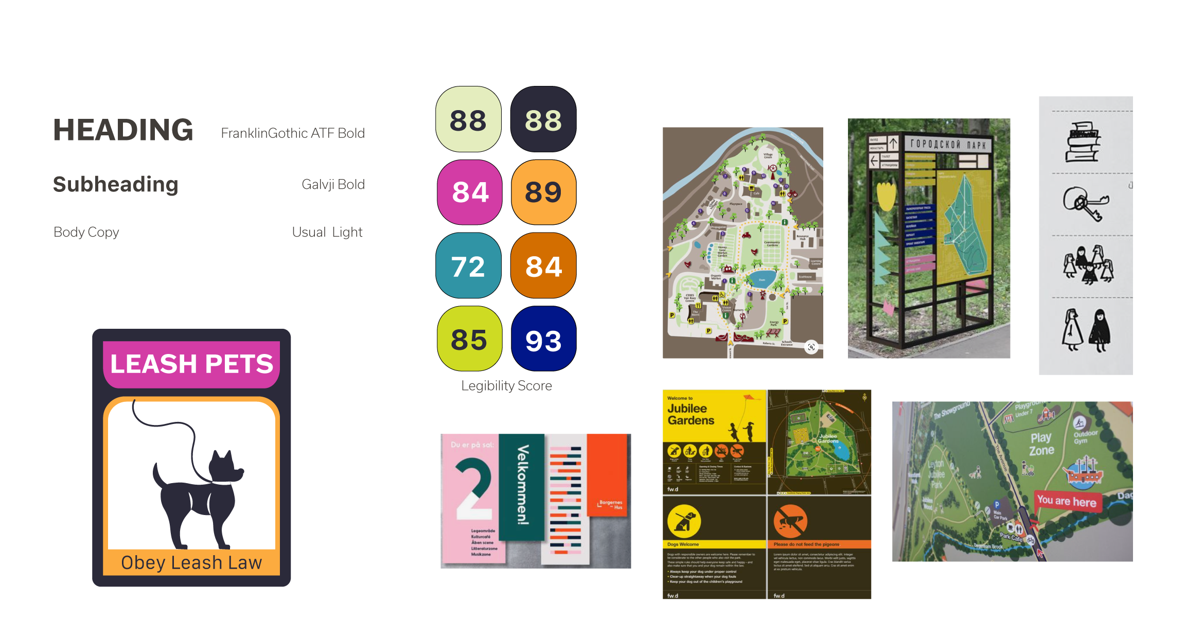
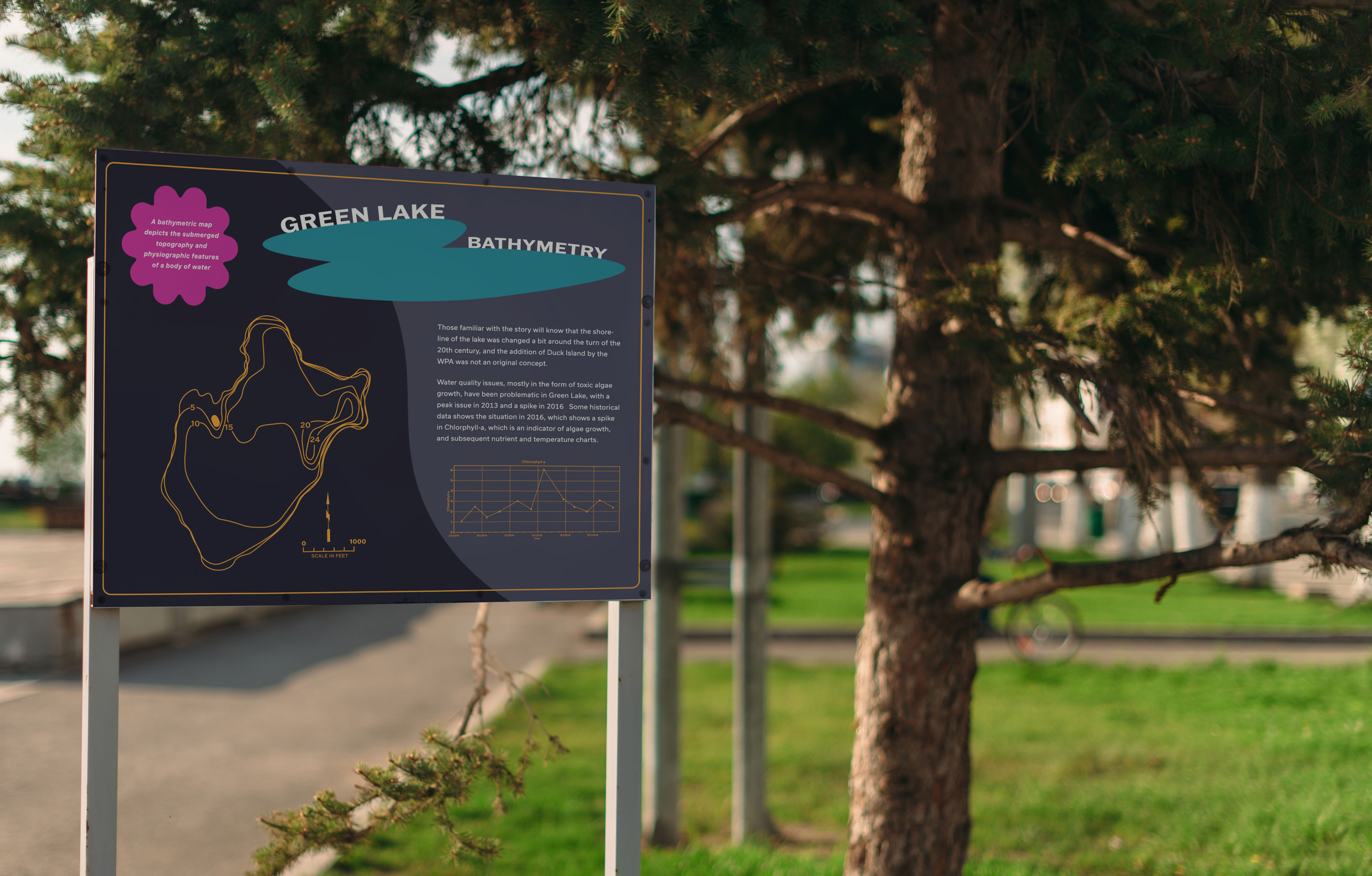
After researching the park and collecting visual references, I began iterating on a mood board and different color and type combinations. I applied these different ideas to a sample sign I created before deciding on a palette with a muted dark background and bright saturated accent colors. To create the point of interest signs, I conducted additional research on the features of the lake and its history.





![]()
![]()
![]()


